
Typography is not just the choice of fonts and letter sizes; it’s an essential component of design that conveys mood, sets the tone, and gives designers a powerful tool to create visual impact. In this guide, we’ll walk through the foundational principles of typography and explore how to effectively harness this element in your design projects, ensuring your messages are not just read but felt and remembered.
Conveying the Right Message for Special Occasions
Every event or celebration has a unique atmosphere and message, which can be elevated by the right choice of typeface. Creating invites for a grown-up birthday celebration can be an exciting opportunity to explore different fonts and design elements that reflect the sophistication and joy of the milestone. A well-designed invitation sets the tone for the event and provides a memorable first impression to the guests.
The Art of Font Selection
Choosing the right font is the first step in mastering typography. Not all fonts are created equal; each has its own personality and emotional impact. Serif fonts often evoke a sense of formality and tradition, while sans-serifs offer a cleaner, more modern feel. When selecting a font, consider the message you want to communicate and the feelings you want to evoke.
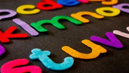
Color Theory in Typography
Color is a powerful tool in typography. It can highlight important information, convey emotions, and create energy within a design. When selecting a color for your text, consider its readability against the background, cultural connotations, and the psychological impact of the color choices.
Hierarchy and Contrast
Effective typography creates a visual hierarchy that guides the reader’s eye to the most important information. By playing with font size, weight, and color, you can create a contrast that differentiates titles from body text, emphasizes key points, and maintains reader interest. Remember, contrast is not just about boldness; it’s about making calculated distinctions that enhance readability and message clarity.
Alignment and Symmetry
Text alignment plays a pivotal role in the overall balance of your design. Left-aligned text is generally easier to read, but centered or right-aligned text may be more appropriate in certain contexts. When using symmetry or asymmetry, maintain a structured alignment that supports the design’s flow and composition.
Practical Legibility
No matter how beautiful your typography is, it fails if it’s not legible. Always prioritize readability: consider the medium of your design, the distance from which it will be read, and the size of your text. Avoid intricate fonts and overly decorative scripts for long passages, as they can be difficult to read at a glance.
Spacing: The Unsung Hero
Space in typography – including kerning, leading, and tracking – affects readability and visual appeal. Kerning adjusts the space between specific letters, leading controls the vertical spacing between lines, while tracking is the uniform space across the text. Mastering spacing makes the text more legible and digestible, leading to a more pleasant reading experience.
Understanding Typefaces and Context
There’s a distinct difference between typefaces and fonts. A typeface is the overall design of lettering; the design can include variations, such as bold, regular, italic, and so on, which make up the font family. Contextual usage of a typeface is crucial in designing an effective and appealing piece. For example, historical documents often use classic typefaces such as Times New Roman, while tech companies might prefer a sleek, minimalistic sans-serif like Helvetica for a modern, clean look.
The Impact of Type on Brand Identity
The choice of typography can significantly influence a brand’s personality and how it is perceived by the audience. A consistent typographic scheme helps in building a strong brand identity and can become as recognizable as the brand logo itself. Fonts used in logos, marketing materials, and other brand communications should align with the characteristics of the brand to create a cohesive image that resonates with consumers.
The Role of Typography in User Interface
The digital age has elevated the importance of typography in the user interface. On-screen reading presents unique challenges due to backlit screens, varying device sizes, and screen resolutions. Selecting a font that performs well across different platforms and devices is essential. Moreover, typography in UI design should complement other design elements and contribute to a seamless user experience.
Final Thoughts
The power of typography lies in its ability to convey more than just words; it creates an atmosphere and elicits emotions. Whether you’re producing a website, poster, or business card, applying these principles of typography will ensure your designs are not only seen but also felt and remembered. Embrace the playful art of type; it can be your design’s most expressive voice.

